01 — Aurora
Aurora
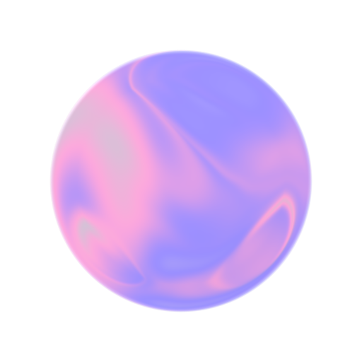
Our surfaces. Translucent, atmospheric, with light passing through. Depth without visual weight: the material behind every card, every modal, every pill.
It looks like you're viewing the site in English. Would you rather continue in Spanish?
View in Spanish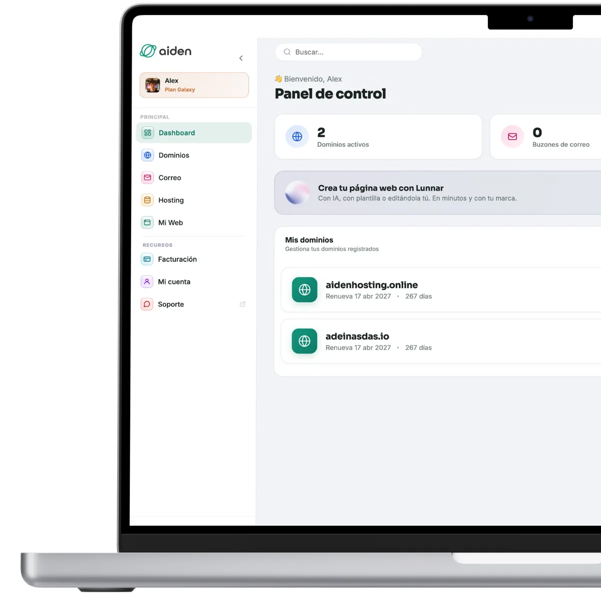 Discover Aiden One


We've redesigned everything. Here's the full story.
For months we've rebuilt Aiden's identity. New typography, new palette, new component system. A visual language that reflects exactly what we do: technology that works, honest services, and clients treated with respect.
It's not a facelift. It's a new perspective on the brand.
Four ideas run through every pixel of the new design system.
Our surfaces. Translucent, atmospheric, with light passing through. Depth without visual weight: the material behind every card, every modal, every pill.
The brand in motion. Continuous pills that morph fluidly between states with cubic-bezier(.16,1,.3,1). Every transition shares the same cadence.
Sora 800 for headlines with editorial weight. Figtree for body copy with maximum legibility. Negative letter-spacing on display for a modern density.
Real prices. Clear features. Honest comparisons that admit when another option is better. Transparency is the product.
Teal as the primary colour: trust, growth, calm. Warm accents for the emotional nuances.
These aren't mockups. They're the real components of the design system. Tap the interactive ones.
Every page is an exercise in coherence. Step in and explore.
Technical details for those who stay to the end.
backdrop-filter: blur(32px) saturate(1.5) · fallbacks for Safari and Firefox.cubic-bezier(.16,1,.3,1) · reveal al scroll · gradient shim 6s infinito.The new Aiden is already live. Explore, discover and tell us what you think.